Widgets
About
Widgets (aka cards, aka charts, aka graphs) provide a simple way to insert blade files into admin panel pages. You can use them to insert cards, charts, notices or custom content into pages.
Requirements
In order to use the Widget class, you should make sure your main views (for new admin panel pages) extend the backpack::blank or backpack_view('blank') blade template. This template includes two sections where you can push widgets:
before_contentafter_content
How to Use
You can easily push widgets to these sections, by using the autoloaded Widget class. You can think of the Widget class as a global container for widgets, for the current page being rendered. That means you can call the Widget container inside a Controller, inside a view, or inside a service provider you create - wherever you want.
use Backpack\CRUD\app\Library\Widget;

Widget::add($widget_definition_array)->to('before_content');

// alternatively, use a fluent syntax to define each widget attribute
Widget::add()
    ->to('before_content')
    ->type('card')
    ->content(null);
Mandatory Attributes
When passing a widget array, you need to specify at least these attributes:
[
   'type' => 'card' // the kind of widget to show
   'content' => null // the content of that widget (some are string, some are array)
],
Optional Attributes
Most widget types also have these attributes present, which you can use to tweak how the widget looks inside the page:
'wrapper' => [
    'class' => 'col-sm-6 col-md-4', // customize the class on the parent element (wrapper)
    'style' => 'border-radius: 10px;',
]
Widgets API
To manipulate widgets, you can use the methods below. The action will be performed on the page being constructed for the current request. And the Widget class is a global container, so you can add widgets to it both from the Controller, and from the view.
// to add a widget to a different section than the default 'before_content' section:
Widget::add($widget_definition_array)->to('after_content');
Widget::add($widget_definition_array)->section('after_content');
Widget::add($widget_definition_array)->group('after_content');

// to create a widget, WITHOUT adding it to a section
Widget::make($widget_definition_array);

// to define the contents of a widget, pass the definition array to the make()/add() methods
Widget::add($widget_definition_array);
Widget::make($widget_definition_array);
// alternatively, define each widget attribute one by one, using a fluent syntax
Widget::add()
    ->to('after_content')
    ->type('card')
    ->content('something');

// to reference a widget later on, give it a unique 'name'
Widget::add($widget_definition_array)->name('my_widget');

// you can then easily modify it
Widget::name('my_widget')->content('some other content'); // change the 'content' attribute
Widget::name('my_widget')->forget('attribute_name'); // unset a widget attribute
Widget::name('my_widget')->makeFirst(); // make a widget the first one in its section
Widget::name('my_widget')->makeLast(); // to make a widget the last one in its section
Widget::name('my_widget')->remove(); // remove the widget from its section
Default Widget Types
Alert
Shows a notification bubble, with the heading and text you specify:
[
    'type'         => 'alert',
    'class'        => 'alert alert-danger mb-2',
    'heading'      => 'Important information!',
    'content'      => 'Lorem ipsum dolor sit amet, consectetur adipisicing elit. Corrupti nulla quas distinctio veritatis provident mollitia error fuga quis repellat, modi minima corporis similique, quaerat minus rerum dolorem asperiores, odit magnam.',
    'close_button' => true, // show close button or not
]
For different colors, you can use the following classes: alert-success, alert-warning, alert-info, alert-danger alert-primary, alert-secondary, alert-light, alert-dark.
Widget Preview:

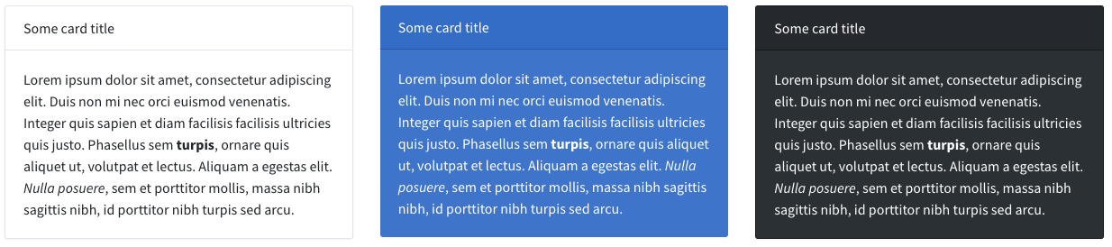
Card
Shows a Bootstrap card, with the heading and body you specify. You can customize the class name to get cards of different color, size, etc.
[
    'type'       => 'card',
    // 'wrapper' => ['class' => 'col-sm-6 col-md-4'], // optional
    // 'class'   => 'card bg-dark text-white', // optional
    'content'    => [
        'header' => 'Some card title', // optional
        'body'   => 'Lorem ipsum dolor sit amet, consectetur adipiscing elit. Duis non mi nec orci euismod venenatis. Integer quis sapien et diam facilisis facilisis ultricies quis justo. Phasellus sem <b>turpis</b>, ornare quis aliquet ut, volutpat et lectus. Aliquam a egestas elit. <i>Nulla posuere</i>, sem et porttitor mollis, massa nibh sagittis nibh, id porttitor nibh turpis sed arcu.',
    ]
]
For different background colors, you can use the following classes: bg-success, bg-warning, bg-info, bg-danger bg-primary, bg-secondary, bg-light, bg-dark.
Other useful helper classes: text-center, text-white.
Widget Preview:
Chart
Shows a pie chart / line chart / bar chart inside a Bootstrap card, with the heading and body you specify.
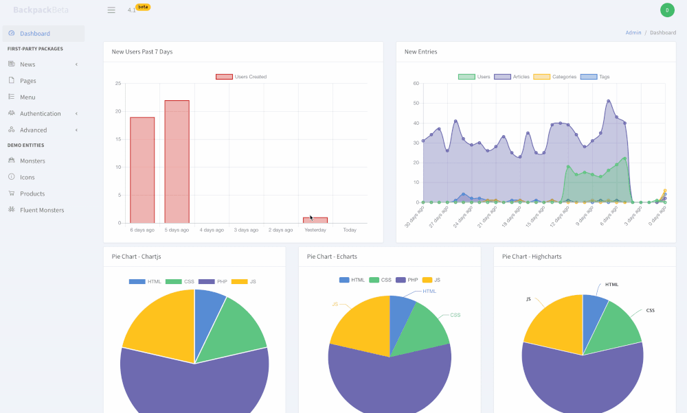
To create and use a new widget chart, you need to:
Step 1. Install laravel-charts, that offers a single PHP syntax for 6 different charting libraries:
composer require consoletvs/charts:"6.*"Step 2. Create a new ChartController:
php artisan backpack:chart WeeklyUsers
This will create:
- a new ChartController inside
app\Http\Controllers\Admin\Charts\WeeklyUsersChartController - a route towards that ChartController in your
routes/backpack/custom.php
Step 3. Add the widget that points to that ChartController you just created:
Widget::add([
    'type'       => 'chart',
    'controller' => \App\Http\Controllers\Admin\Charts\WeeklyUsersChartController::class,

    // OPTIONALS

    // 'class'   => 'card mb-2',
    // 'wrapper' => ['class'=> 'col-md-6'] ,
    // 'content' => [
         // 'header' => 'New Users',
         // 'body'   => 'This chart should make it obvious how many new users have signed up in the past 7 days.<br><br>',
    // ],
]);
Step 4. Configure the ChartController you just created:
public function setup()(MANDATORY)- initialize and configure
$this->chart, using the methods detailed in the laravel-charts documentation; - you can define your dataset here, if you want your DB queries to be called upon page load;
- initialize and configure
public function data()(OPTIONAL, but recommended)- use
$this->chart->dataset()to configure what the chart should contain; - if it's defined, the chart will loads its contents using AJAX;
- use
Optionally:
- you can easily switch the JavaScript library used, by changing the use statement at the top of this file:
-use ConsoleTVs\Charts\Classes\Chartjs\Chart;
+use ConsoleTVs\Charts\Classes\Echarts\Chart;
+use ConsoleTVs\Charts\Classes\Fusioncharts\Chart;
+use ConsoleTVs\Charts\Classes\Highcharts\Chart;
+use ConsoleTVs\Charts\Classes\C3\Chart;
+use ConsoleTVs\Charts\Classes\Frappe\Chart;- you can change the path to the JS library; if you don't want it loaded from a CDN, you can define
$libraryorgetLibraryFilePath()on your ChartController:
protected $library = 'http://path/to/file';

// or

public function getLibraryFilePath()
{
    return asset('path/to/your/js/file');

    // or

    return [
        asset('path/to/first/js/file'),
        asset('path/to/second/js/file'),
    ];
}
That's it! Refresh the page to see your new chart widget. Below, you'll find a few examples of how the ChartController can end up looking.
Example 1: ChartController that loads results using AJAX:
<?php

namespace App\Http\Controllers\Admin\Charts;

use App\User;
use Backpack\CRUD\app\Http\Controllers\ChartController;
use Backpack\NewsCRUD\app\Models\Article;
use Backpack\NewsCRUD\app\Models\Category;
use Backpack\NewsCRUD\app\Models\Tag;
use ConsoleTVs\Charts\Classes\Chartjs\Chart;

class NewEntriesChartController extends ChartController
{
    public function setup()
    {
        $this->chart = new Chart();

        // MANDATORY. Set the labels for the dataset points
        $labels = [];
        for ($days_backwards = 30; $days_backwards >= 0; $days_backwards--) {
            if ($days_backwards == 1) {
            }
            $labels[] = $days_backwards.' days ago';
        }
        $this->chart->labels($labels);

        // RECOMMENDED.
        // Set URL that the ChartJS library should call, to get its data using AJAX.
        $this->chart->load(backpack_url('charts/new-entries'));

        // OPTIONAL.
        $this->chart->minimalist(false);
        $this->chart->displayLegend(true);
    }

    /**
     * Respond to AJAX calls with all the chart data points.
     *
     * @return json
     */
    public function data()
    {
        for ($days_backwards = 30; $days_backwards >= 0; $days_backwards--) {
            // Could also be an array_push if using an array rather than a collection.
            $users[] = User::whereDate('created_at', today()
                ->subDays($days_backwards))
                ->count();
            $articles[] = Article::whereDate('created_at', today()
                ->subDays($days_backwards))
                ->count();
            $categories[] = Category::whereDate('created_at', today()
                ->subDays($days_backwards))
                ->count();
            $tags[] = Tag::whereDate('created_at', today()
                ->subDays($days_backwards))
                ->count();
        }

        $this->chart->dataset('Users', 'line', $users)
            ->color('rgb(77, 189, 116)')
            ->backgroundColor('rgba(77, 189, 116, 0.4)');

        $this->chart->dataset('Articles', 'line', $articles)
            ->color('rgb(96, 92, 168)')
            ->backgroundColor('rgba(96, 92, 168, 0.4)');

        $this->chart->dataset('Categories', 'line', $categories)
            ->color('rgb(255, 193, 7)')
            ->backgroundColor('rgba(255, 193, 7, 0.4)');

        $this->chart->dataset('Tags', 'line', $tags)
            ->color('rgba(70, 127, 208, 1)')
            ->backgroundColor('rgba(70, 127, 208, 0.4)');
    }
}
Example 2. Pie chart with both labels and dataset defined in the setup() method (no AJAX):
<?php

namespace App\Http\Controllers\Admin\Charts\Pies;

use Backpack\CRUD\app\Http\Controllers\ChartController;
use ConsoleTVs\Charts\Classes\Chartjs\Chart;

class ChartjsPieController extends ChartController
{
    public function setup()
    {
        $this->chart = new Chart();

        $this->chart->dataset('Red', 'pie', [10, 20, 80, 30])
                    ->backgroundColor([
                        'rgb(70, 127, 208)',
                        'rgb(77, 189, 116)',
                        'rgb(96, 92, 168)',
                        'rgb(255, 193, 7)',
                    ]);

        // OPTIONAL
        $this->chart->displayAxes(false);
        $this->chart->displayLegend(true);

        // MANDATORY. Set the labels for the dataset points
        $this->chart->labels(['HTML', 'CSS', 'PHP', 'JS']);
    }
}
Div
Allows you to include multiple widgets in the div attributes of your choice. For example, you can include multiple widgets in a <div class="row"></div> with the code below:
[
    'type'    => 'div',
    'class'   => 'row',
    'content' => [ // widgets
        [ 'type' => 'card', 'content' => ['body' => 'One'] ],
        [ 'type' => 'card', 'content' => ['body' => 'Two'] ],
        [ 'type' => 'card', 'content' => ['body' => 'Three'] ],
    ]
]
Anything you specify on this widget, other than type and content, has to be a string, and will be considered an attribute of the "div" element.
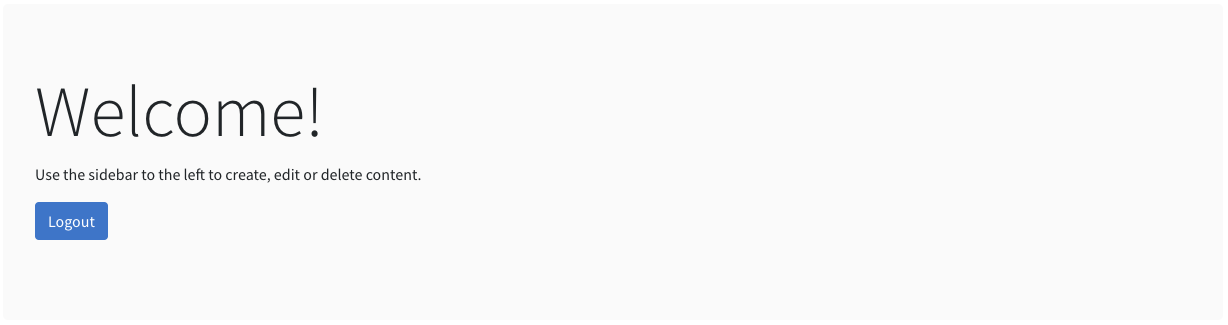
Jumbotron
Shows a Bootstrap jumbotron component, with the heading and body you specify.
[
    'type'        => 'jumbotron',
    'heading'     => 'Welcome!',
    'content'     => 'Use the sidebar to the left to create, edit or delete content.',
    'button_link' => backpack_url('logout'),
    'button_text' => 'Logout',
]
Widget Preview:
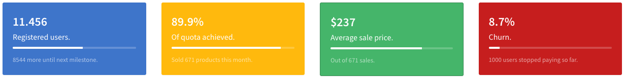
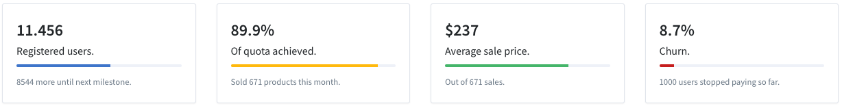
Progress
Shows a colorful card to signify the progress towards a goal. You can customize the class name to get cards of different color, size, etc.
[
    'type'        => 'progress',
    'class'       => 'card text-white bg-primary mb-2',
    'value'       => '11.456',
    'description' => 'Registered users.',
    'progress'    => 57, // integer
    'hint'        => '8544 more until next milestone.',
]
For different background colors, you can use the following classes: bg-success, bg-warning, bg-info, bg-danger bg-primary, bg-secondary, bg-light, bg-dark.
Other useful helper classes: text-center, text-white.
Widget Preview:
Progress White
Shows a white card to signify the progress towards a goal. You can customize the class name to get progress bars of different color.
[
    'type'          => 'progress_white',
    'class'         => 'card mb-2',
    'value'         => '11.456',
    'description'   => 'Registered users.',
    'progress'      => 57, // integer
    'progressClass' => 'progress-bar bg-primary',
    'hint'          => '8544 more until next milestone.',
]
For different progress bar colors, you can use the following classes: bg-success, bg-warning, bg-info, bg-danger bg-primary, bg-secondary, bg-light, bg-dark.
Widget Preview:
View
Loads a blade view from a location you specify. Any attributes you give it will be available in the $widget variable inside that view.
[
    'type'     => 'view',
    'view'     => 'path.to.custom.view',
    'someAttr' => 'some value',
]
It helps load blade files that are not specifically created to be widgets, that live in a different path than resources/views/vendor/backpack/base/widgets, as if they were widgets.
Overwriting Default Widget Types
You can overwrite a widget type by placing a file with the same name in your resources\views\vendor\backpack\base\widgets directory. When a file is there, Backpack will pick that one up, instead of the one in the package. You can do that from command line using php artisan backpack:publish base/widgets/widget-name
Examples:
- creating a
resources\views\vendor\backpack\base\widgets\card.blade.phpfile would overwrite thecardwidget functionality; php artisan backpack:publish base/widgets/cardwill take the view from the package and copy it to the directory above, so you can edit it;
Keep in mind that when you're overwriting a default widget type, you're forfeiting any future updates for that widget. We can't push updates to a file that you're no longer using.
Creating a Custom Widget Type
Widgets consist of only one file - a blade file with the same name as the widget type (ex: card.blade.php). You can create one by placing a new blade file inside resources\views\vendor\backpack\base\widgets. Be careful to choose a distinctive name, otherwise you might be overwriting a default widget type (see above).
For example, you can create a well.blade.php:
@includeWhen(!empty($widget['wrapper']), 'backpack::widgets.inc.wrapper_start')
    <div class="{{ $widget['class'] ?? 'well mb-2' }}">
        {!! $widget['content'] !!}
    </div>
@includeWhen(!empty($widget['wrapper']), 'backpack::widgets.inc.wrapper_end')
You can then use the well widget in a Controller or View:
@extends(backpack_view('blank'))

@php
    Widget::add([
        'type'    => 'well',
        'wrapper' => ['class' => 'col-sm-12'],
        'content' => 'This text will be in a div with the class "<i>well</i>".',
    ]);
@endphp

@section('content')
@endsection
To use information from the database, you can:
- use the full namespace for your models, like
\App\Models\Product::count(); - load all your dashboard information using AJAX calls, if you're loading charts, reports, etc, and the DB queries might take a long time;
- use view composers to push variables inside this view when it's loaded, Like.
View::composer('backpack::widgets.well, 'App\Http\View\Composers\WellComposer');
Inside the widget blade files, you include custom CSS and JS, by pushing to the stacks in the layout:
@includeWhen(!empty($widget['wrapper']), 'backpack::widgets.inc.wrapper_start')
    <div class="{{ $widget['class'] ?? 'well mb-2' }}">
        {!! $widget['content'] !!}
    </div>
@includeWhen(!empty($widget['wrapper']), 'backpack::widgets.inc.wrapper_end')

@push('after_styles')
    <link href="{{ asset('packages/select2/dist/css/select2.min.css') }}" rel="stylesheet" type="text/css" />
    <style>
        .some_class {
            color: red;
        }
    </style>
@endpush


@push('after_scripts')
    <script src="{{ asset('packages/select2/dist/js/select2.min.js') }}"></script>
    <script>
        jQuery(document).ready(function($) {
            // trigger select2 for each untriggered select2 box
            $('.select2_field').each(function (i, obj) {
                if (!$(obj).hasClass("select2-hidden-accessible"))
                {
                    $(obj).select2({
                        theme: "bootstrap"
                    });
                }
            });
        });
    </script>
@endpush
Using a Widget Type from a Package
You can choose the view namespace when loading a widget:
// using the fluent syntax, use the 'from' alias
Widget::add($widget_definition_array)->from('package::widgets');

// using the widget definition array, specify its 'viewNamespace'
Widget::add([
    'type'          => 'card',
    'viewNamespace' => 'package::widgets',
    'wrapper'       => ['class' => 'col-sm-6 col-md-4'],
    'class'         => 'card text-white bg-primary text-center',
    'content'       => [
        // 'header' => 'Another card title',
        'body'      => 'Lorem ipsum dolor sit amet, consectetur adipiscing elit. Duis non mi nec orci euismod venenatis. Integer quis sapien et diam facilisis facilisis ultricies quis justo. Phasellus sem <b>turpis</b>, ornare quis aliquet ut, volutpat et lectus. Aliquam a egestas elit.',
    ],
]);
Similarly, if you want to create widgets somewhere else than in resources/views/vendor/backpack/base/widgets, you can pass that directory as the namespace of your widget. For example, resources/views/admin/widgets would have admin.widgets as the namespace.