Blade Components
About
Blade components are a quick way for you to output a bit of HTML... that can then be customized by each Backpack theme. It's a clean way of echoing theme-agnostic components, because for each Component that Backpack provides, the theme itself can customize and make it pretty in their own way.
How to Use
Anywhere in your blade files, you can use the Blade components we have. But most likely you'll be using them in your resources/views/vendor/backpack/ui/inc/menu_items.blade.php, because all our components currently are concerned with outputting menu items in a theme-agnostic way.
Mandatory Attributes
There are no mandatory attributes.
Optional Attributes
All components also allow you to specify custom attributes. When you specify a custom attribute, that attribute will be placed on the most likely element of that component. In most cases, that is the anchor element. For example:
<x-backpack::menu-item title="Tags" icon="la la-tag" :link="backpack_url('tags')" target="_blank" />Even though the 'target' attribute doesn't technically exist in the component, that attribute will be placed on that component's a element.
UI Components
Menu Item
Shows a menu item, with the title and link you specify:
<x-backpack::menu-item title="Tags" icon="la la-tag" :link="backpack_url('tags')" />Note that you can further customize this using custom attributes. If you define a target on it, that will be passed down to the a element.
Menu Separator
Shows a menu separator, with the title you specify:
<x-backpack::menu-separator title="Some text for separation" />Note that you can further customize this using custom attributes. If you define a class on it, that will be passed down to the li element.
Menu Dropdown & Menu Dropdown Item
To show a dropdown menu, with elements, you can use the menu-dropdown and menu-dropdown-item components:
<x-backpack::menu-dropdown title="Authentication" icon="la la-group">
    <x-backpack::menu-dropdown-item title="Users" icon="la la-user" :link="backpack_url('user')" />
    <x-backpack::menu-dropdown-item title="Roles" icon="la la-group" :link="backpack_url('role')" />
    <x-backpack::menu-dropdown-item title="Permissions" icon="la la-key" :link="backpack_url('permission')" />
</x-backpack::menu-dropdown>
Notes:
- on
menu-dropdownyou can definenested="true"to flag that dropdown as nested (aka. having a parent); so you can have dropdown in dropdown in dropdown; - on both components, you can also define custom attributes; eg. if you define a
targeton one, that will be passed down to theaelement;
Data Components
These are the components that Backpack uses inside the default CRUD operations. Starting Backpack v7, they are exposed as components, so that you can also use them outside the CrudControllers, or in your custom operations.
Dataform
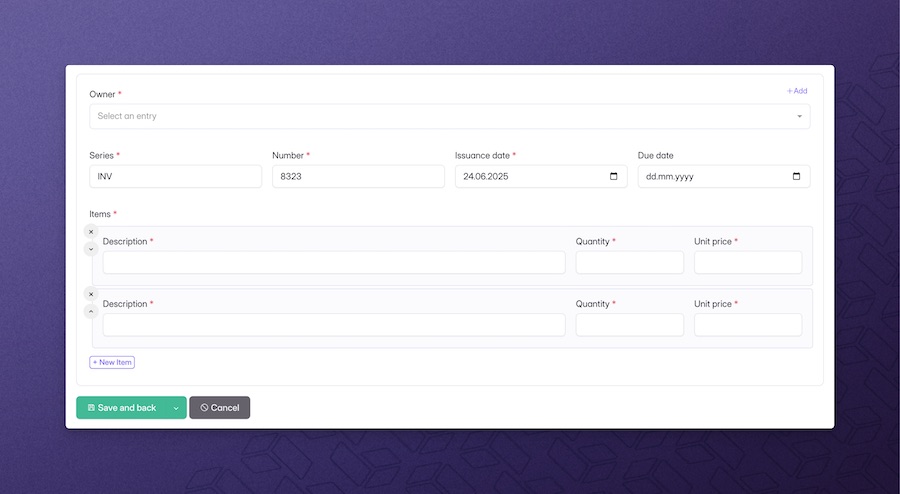
This component helps you show a form anywhere you want, so the admin can easily create or edit an entries for an Eloquent model. The dataform component is a extension of a CrudController - so a CrudController for that entity needs to be already set up, and passed to this component as a parameter:
<x-bp-dataform controller="\App\Http\Controllers\Admin\InvoiceCrudController" />Configuration options:
operation='create'- by default, the datatable component will pick up everything that controller sets up for the Create operation; if you want to change the operation it will initialize, you can pass this parameter;:entry="\App\Models\Invoice::find(1)"- if you want to use UpdateOperation or a custom form operation that needs the entry;:setup="function($crud, $parent) {}"- if you want to make changes to the operation setup (eg. add/remove fields, configure functionality), you can use this parameter; the closure passed here will be run after the setup of that operation had already completed;:save-actions="[]"- provide an array of save action definitions or save action classes to replace the defaults (see Custom save actions);:form-inside-card="true"- render the form inside a Backpack card wrapper so it visually matches the default create/update screens; leave itfalseto output only the raw form markup.
Advanced example:
<x-bp-dataform
    controller="\App\Http\Controllers\Admin\InvoiceCrudController"
    name="invoice_form"
    operation="update"
    :entry="\App\Models\Invoice::find(1)"
    :setup="function($crud, $parent) {
        $crud->removeColumn('notes');
    }"
 />
Custom save actions
The Dataform component can swap out the default Save and back / edit / new buttons with your own logic. Pass an array to the :save-actions attribute containing save action classes (or definitions) that implement Backpack's SaveActionInterface:
@php
    use App\Backpack\Crud\SaveActions\SaveAndApprove;
    use Backpack\CRUD\app\Library\CrudPanel\SaveActions\SaveAndBack;
@endphp

<x-bp-dataform
    controller="\App\Http\Controllers\Admin\InvoiceCrudController"
    :save-actions="[
        new SaveAndApprove,
        SaveAndBack::class,
    ]"
/>
Each entry in the array can be:
- an instance of a class that implements
SaveActionInterface(recommended); - the fully qualified class name of a save action (the container will resolve it);
- a plain array definition (see
crud-save-actions.md).
Backpack will replace the default actions for that form, honour the order defined by each class, and fallback to the first action if no default applies.
Dataform Modal
This component helps you show a form anywhere you want inside a modal, so the admin can easily create or edit an entry for an Eloquent model without having to refresh the whole page.
To use this component you are required to add CreateInModalOperation and/or UpdateInModalOperation in your CrudController. The dataform modal component is a extension of a CrudController - so a CrudController for that entity needs to be already set up, and passed to this component as a parameter:
First, in your CrudController, either remove CreateOperation in favor of CreateInModalOperation, or you can keep both operations. Having both of them is usefull if you want your ListOperation to still show the regular "Create" button, but you would like also to have the possibility to create this entity somewhere else in your application using a modal form.
use \Backpack\DataformModal\Http\Controllers\Operations\CreateInModalOperation;<x-bp-dataform-modal controller="\App\Http\Controllers\Admin\InvoiceCrudController" />Configuration options:
operation='createInModal'- by default, the component will pick up everything that controller sets up for the Create operation; if you want to change the operation it will initialize, you can pass this parameter, eg:updateInModal:entry="\App\Models\Invoice::find(1)"- if you want to use UpdateInModalOperation or a custom form operation that needs the entry;:setup="function($crud, $parent) {}"- if you want to make changes to the operation setup (eg. add/remove fields, configure functionality), you can use this parameter; the closure passed here will be run after the setup of that operation had already completed;:save-actions="[]"- replace the default modal buttons with your own save action classes.
Advanced example:
<x-bp-dataform-modal
    controller="\App\Http\Controllers\Admin\InvoiceCrudController"
    name="invoice_form"
    operation="updateInModal"
    :entry="\App\Models\Invoice::find(1)"
    :setup="function($crud, $parent) {
        $crud->removeColumn('notes');
    }"
/>NOTE: The date_picker (jquery version) does not properly work in this context. Please use any alternative.
Datatable
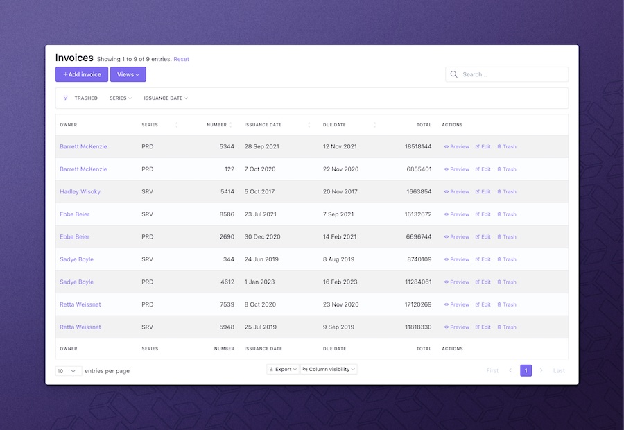
Useful if you want to show the entries in the database, for an Eloquent model. This component shows a datatable anywhere you want, so the admin to easily list, filter, search and perform other operations on entries of an Eloquent model. The datatable component is a extension of a CrudController - so a CrudController for that entity needs to be already set up, and passed to this component as a parameter:
<x-bp-datatable controller="\App\Http\Controllers\Admin\InvoiceCrudController" />Configuration options:
name='invoices_datatable'- by default, a name will be generated; but you can pick one you can recognize;operation='list'- by default, the datatable component will pick up everything that controller sets up for the List operation; if you want to change the operation it will initialize, you can pass this parameter;:useFixedHeader="false"- set this to explicitly enable or disable the sticky header; it defaults to the operation'suseFixedHeadersetting, falling back totrue;:setup="function($crud, $parent) {}"- if you want to make changes to the operation setup (eg. add/remove columns, configure functionality), you can use this parameter; the closure passed here will be run after the setup of that operation had already completed;
Advanced example:
<x-bp-datatable
    controller="\App\Http\Controllers\Admin\InvoiceCrudController"
    name="invoices"
    operation="show"
    :setup="function($crud, $parent) {
        if ($parent) {
            $crud->addClause('where', 'customer_id', $parent->id);
        }
    }"
 />
Datagrid
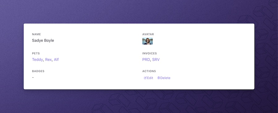
Useful if you want to show the attributes of an entry in the database (the attributes of an Eloquent model). This components shows a grid view with all attributes that are configured using CRUD columns.
There are two ways to use the Datagrid component:
Datagrid for an existing CrudController
Your datagrid will pick up the configuration in your CrudController automatically.
<x-bp-datagrid
    controller="\App\Http\Controllers\Admin\InvoiceCrudController"
    :entry="\App\Models\Invoice::first()"
/>
Configuration options:
name='datagrid'- by default, a name will be generated; but you can pick one you can recognize;operation='show'- by default, the datagrid component will pick up everything that controller sets up for the Show operation; if you want to change the operation it will initialize, you can pass this parameter;:setup="function($crud, $entry) {}"- if you want to make changes to the operation setup (eg. add/remove columns, configure functionality), you can use this parameter; the closure passed here will be run after the setup of that operation had already completed;
Advanced example:
<x-bp-datagrid
    controller="\App\Http\Controllers\Admin\PetShop\OwnerCrudController"
    operation="show"
    :entry="\App\Models\Owner::first()"
    :setup="function($crud, $entry) {
        $crud->removeButton('delete');

        Widget::collection()->get('pets_crud')?->remove();
        Widget::collection()->get('invoices_crud')?->remove();
    }"
/>
Datagrid for an Eloquent entry
If you want to show a datagrid component for a entity that does not have a CrudController, you can do that too. But you have to manually specify the columns you want to be shown:
<x-bp-datagrid
    :entry="\App\User::find(1)"
    :columns="[
        ['label' => 'Name', 'type' => 'text', 'name' => 'name', 'size' => 6],
        ['label' => 'Email', 'type' => 'email', 'name' => 'email', 'size' => 6],
        ['label' => 'Created At', 'type' => 'datetime', 'name' => 'created_at'],
        ['label' => 'Updated At', 'type' => 'datetime', 'name' => 'updated_at'],
    ]" />
Datalist
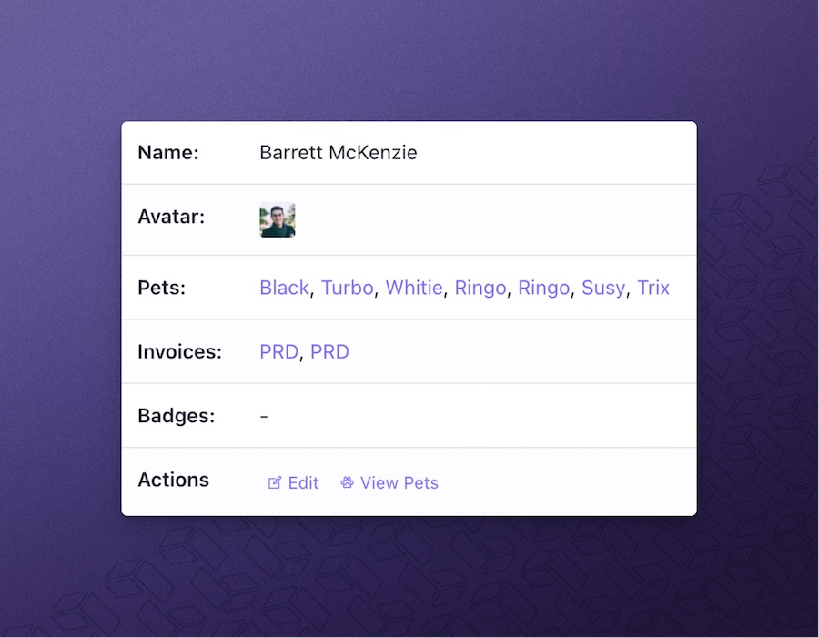
Useful if you want to show the attributes of an entry in the database (the attributes of an Eloquent model). This components shows a table with all attributes that are configured using CRUD columns.
There are two ways to use the Datalist component:
Datalist for an existing CrudController
Your datalist will pick up the configuration in your CrudController automatically.
<x-bp-datalist
    controller="\App\Http\Controllers\Admin\InvoiceCrudController"
    :entry="\App\Models\Invoice::first()"
/>
Configuration options:
name='invoices_datalist'- by default, a name will be generated; but you can pick one you can recognize;operation='show'- by default, the datalist component will pick up everything that controller sets up for the Show operation; if you want to change the operation it will initialize, you can pass this parameter;:setup="function($crud, $entry) {}"- if you want to make changes to the operation setup (eg. add/remove columns, configure functionality), you can use this parameter; the closure passed here will be run after the setup of that operation had already completed;
Advanced example:
<x-bp-datalist
    controller="\App\Http\Controllers\Admin\PetShop\OwnerCrudController"
    operation="show"
    :entry="\App\Models\Owner::first()"
    :setup="function($crud, $entry) {
        $crud->removeButton('delete');

        Widget::collection()->get('pets_crud')?->remove();
        Widget::collection()->get('invoices_crud')?->remove();
    }"
/>
Datalist for an Eloquent entry
If you want to show a datalist component for a entity that does not have a CrudController, you can do that too. But you have to manually specify the columns you want to be shown:
<x-bp-datalist
    :entry="\App\User::find(1)"
    :columns="[
        ['label' => 'Name', 'type' => 'text', 'name' => 'name', 'size' => 6],
        ['label' => 'Email', 'type' => 'email', 'name' => 'email', 'size' => 6],
        ['label' => 'Created At', 'type' => 'datetime', 'name' => 'created_at'],
        ['label' => 'Updated At', 'type' => 'datetime', 'name' => 'updated_at'],
    ]" />
Syntaxes for Using Components
All components that Backpack provides are available to use both using the "full namespace" syntax:
<x-backpack::datatable>and using the slightly shorter "alias" syntax:
<x-bp-datatable>You can use whichever one you prefer. But please note that if you need to pass the components to a dynamic Laravel Blade component, only the "alias" syntax will work (eg. you will pass :component='bp-datagrid'). This is a limitation from Laravel, not Backpack.
Overriding Default Components
You can override a component by placing a file with the same name in your resources\views\vendor\backpack\ui\components directory. When a file is there, Backpack will pick that one up, instead of the one in the package.
Avoid doing this. When you're overwriting a component, you're forfeiting any future updates for that component. We can't push updates to a file that you're no longer using.
Creating a Custom Component
We do not support creating custom components within the backpack namespace. If you want to create a custom component, please create one in the app namespace. The Laravel docs on Blade Components will teach you everything you need to know.