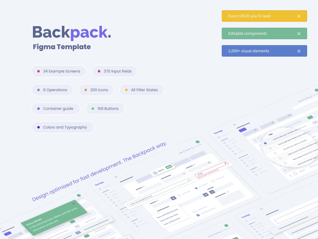
Figma Template
Quickly create designs and mockups, using Backpack's design, screens and components.

Prototype your admin panel, before you write a single line of code! Using Figma's drag & drop interface.
Sometimes, when you're not 100% sure what you're building... a fully-working admin panel might be overkill. You could spend hours/days coding it, only for your client or partners to say "no". We've created the Backpack Figma Template for those exact times. It empowers you to prototype before coding.
Get your designers & developers to use the same building blocks for admin panels. Reduce design & development time!
Other times, in bigger teams and projects, the developer doesn't have the freedom to decide how the admin panel should look and feel. It's up to the designer. Or the Architect. Or the Project Manager. Or the Client. They'll sketch out how the admin panel looks and works, and the developer codes their wishes. Naturally, since those people are not familiar with how Backpack works, they'll make design decisions that are unnecessarily expensive. Admin panels are pretty standard, but it's easy to go overboard and design screens and processes that take a lot of time to build, when there's a perfectly good alternative - to use what Backpack already provides. For teams who follow this process, this template will empower designers and other non-developers types to design their admin panel, while using as many standard Backpack components as possible. And that more they stick to what Backpack already offers, the quicker and cheaper it'll be to build it out.
Contents
In a word... EVERYTHING. ALL components provided by Backpack, looking exactly as they do in our CoreUIv2 theme. This package includes the standard design for:
All Backpack operations (as seen in our demo): List, Create, Update, Delete, Show, Clone, Reorder, Revise, InlineCreate, BulkDelete, BulkClone

All Backpack components (as used in our demo by various CRUDs and custom pages):
- all 57 fields (in 2 sizes, plus field states - untouched, hover, active)
- all 27 columns
- all 9 filters
- all 6 widgets

All Backstrap components (the HTML Template that powers Backpack, as seen in its demo): colors, typography, breadcrumbs, cards, carousel, collapse (aka accordion), forms, jumbotron (aka hero unit), list group, navs, pagination, popovers, progress bars, scrollspy, switches (aka toggles), tables, tabs, tooltips, buttons, button groups, dropdowns, brand buttons, charts, alerts, badges, modals, widgets, error pages, dashboards, icons, flags

An example CRUD, to get you started right away with building your screens (just duplicate and change)

We've specifically chosen Figma because it's free (for basic usage), it's easier to learn than all other tools, and it's collaborative (like Google Docs). If you're working inside a team with non-developers and want to avoid misunderstands, decrease the time it takes to build and maintain admin panels, and put as little pressure as possible on your developers... we recommend you include the Backpack Figma Template in your workflow. Try it out, we think you're going to love it.
Installation
Step 1. Purchase this package - you'll get a .fig file.
Step 2. Sign up for a Figma account, optionally install the Figma app on your machine, then open the .fig file in Figma.
Step 3. If you have suggestions or problems, please request access to the Github repo for this package. You'll be able to submit issues and download updates. We use this ourselves in our client projects, so we regularly update it, to make all our lives easier.
Would rather use Sketch, InDesign, Illustrator, Photoshop etc.?
We're in the process of converting this template to other formats. Please send an email to [email protected] and tell us what design software you prefer. It might already be ready, just not yet public.
What if you're using theme-tabler or theme-coreuiv4?
Unfortunately we do not have Figma templates for those themes in particular. Please send an email to [email protected] and tell us if you need it. If enough people ask for them, we might create them.
License
This software is released under the End-User License Agreement (EULA) of Private Backpack Addons.
Package Access
You don't currently have access to this package. To gain access, go ahead and purchase it. You'll get:
Next 12 months
- download or install using Composer;
- all updates (major, minor and patch);
After 12 months
- can still access all versions and updates you paid;
- can still install using Composer;
- no new versions or updates;