New in v6: Turn Multiple CRUD Buttons into a Dropdown
Do you find yourself drowning in a sea of action buttons in your CRUD table? You're not alone! Too many buttons can create a cluttered...
Do you find yourself drowning in a sea of action buttons in your CRUD table? You're not alone! Too many buttons can create a cluttered...
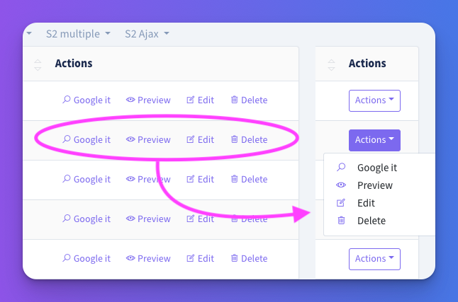
Do you find yourself drowning in a sea of action buttons in your CRUD table? You're not alone! Too many buttons can create a cluttered look and make navigation tricky. Thankfully, starting with Backpack v6.3.2, we already had a solution—turning those action buttons into a dropdown. But in Backpack v6.7.37, @pxpm has taken it one step further.
Previously, if you wanted to clean up your buttons, you could organize them into a dropdown Instead of displaying a long row of action buttons. Just one simple setting giving your CRUD a much cleaner look:
CRUD::setOperationSetting('lineButtonsAsDropdown', true);

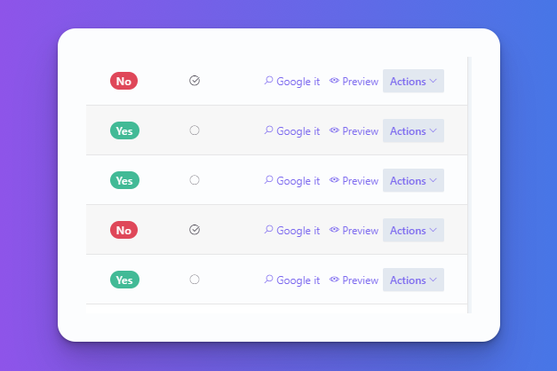
In Backpack v6.7.37, you get even more control over your dropdown. Want to keep a few buttons visible while the rest go into the dropdown? No problem! You can now choose exactly how many buttons remain inline before they get folded into a dropdown.

You can specify how many buttons should stay inline and keep your most important actions front and center:
// Force the first 3 buttons to be inline, and the rest in a dropdown (default: 0)
CRUD::setOperationSetting('lineButtonsAsDropdownShowBefore', 3);

// If there are less than 5 buttons, don't create the dropdown (default: 1)
CRUD::setOperationSetting('lineButtonsAsDropdownMinimum', 5);
With these settings, if there are 5 or more buttons, the first 3 will remain visible while the rest will be tucked into a dropdown.
This new feature in Backpack v6 allows you to clean up your action buttons while maintaining usability. Whether you want all your actions hidden in a dropdown or prefer to keep some visible, this solution is straightforward and effective.
For more information, check out the Backpack documentation.
Subscribe to our "Article Digest". We'll send you a list of the new articles, every week, month or quarter - your choice.
What do you think about this?
Wondering what our community has been up to?